
Introduction
The worldwide supply of food in addition to the conditions of access to it by individuals, is strictly connected to the concept of food security. The Food and Agriculture Organization of the United Nations (FAO) identifies the four pillars of food security as availability, access, utilization, and stability.
In this framework, the volatility of commodity prices on the agricultural market observed in recent years is an issue, so much so that the European and international agricultural policy has shown a clear interest in effectively reducing it. Between 2008 and 2011 there were changes in price of as much as 100% from one year to another. Maize (corn) was worth euro 129 per ton (129/t) in July 2006, euro 283/t in March 2008 (+ 119%), euro 139/t in September 2009 (-51%) and fluctuated around this level in 2010. In 2011 it rose to euro 290/t (+ 109%). The price of other cereals has had a similar trend and dramatic swings.
These oscillations are due to several reasons, often complex and sometimes linked to real speculation based on emotion and ignorance of Securities Dealers.
The first and perhaps most important structural element of agricultural market volatility lies in the inherent fluctuation that is the basis of farm production. A good or a bad year from a climate point of view can have decisive impacts on production levels of a company and/or region, with the markets being quite sensitive to weather information that affects the yield potential of the growing crop. It is important for market operators to be able to predict the market price in order to maximize financial returns, but if high and volatile prices attract the most attention, low prices and volatility are problematic with extensive negative impacts on the agriculture sector, food security and the wider economy in both developed and developing countries (Toscano et al. 2012). For instance, a drought event in an area at risk seriously damages crops (Dono et al. 2013, 2016; Vignaroli et al. 2016).
Furthermore, Khoury et al. (2014) have shown in their study that since 1961, human diets around the world have been changing and becoming more similar. Those diets are mostly composed of a few staple commodity crops, which “have increased substantially in the share of the total food energy (calories), protein, fat, and food weight that they provide to the world’s human population, including wheat, rice, sugar, maize, soybean (by +284%), palm oil (by +173%), and sunflower (by +246%)”.
This fact, on the one hand has relieved the under-nutrition conditions of the poorest people but on the other has increased the dependence of worldwide supply of food on other factors, such as speculation, weather conditions either directly since it makes agriculture more vulnerable to major threats like drought, or indirectly by favoring the spread of insect pests and diseases, oil price volatility and the utilization of a large area of land to grow maize for biofuels production.
The effects of relevant shocks such as the impressive sequence of fires in the Russian Federation that dramatically reduced grain production and determined a cereals price peak (Welton 2011) in spring-summer 2011, provide a significant example of this dependence.
Even climate change and its perception play a role (Nguyen et al. 2016). For example, it has been demonstrated that rising temperature (+2◦ or +4◦) reduces wheat production at global scale, although with different local rates (Asseng et al. 2014). Thus, price volatility is an undesirable market feature because it poses difficulties for both buyers and producers.
These difficulties are amplified for wheat that, among other uses, is employed as a basic element/component of foods, nourishing a large share of the world population. Similarly to rice, maize and soybean, wheat has become a staple in over 97% of countries (Khoury et al. 2014). Having a model able to understand how the staple commodity crops price is formed is thus of primary importance. With this aim we started building a computational model being convinced that this approach is the most suitable to account for the interaction among the several factors affecting market price and to suggest stabilization policies.
In this paper, we build on a computational model which provides the basic elements to analyze international commodities markets. The work presented aims at adapting this model to a particular commodity, i.e. wheat, in order to understand the worldwide wheat price formation and dynamics. Another significant output of this adapted model concerns the dynamics of the relative trade network. In fact, several studies investigate modeling of the trade network itself in order to set a measure of network vulnerability and predict the network resilience to the effects on production of future shocks, such as extreme weather events (see Fair et al. 2017 and references therein).
The paper is organized as follows. We first present the functioning of the general version of the computational model. We then explain the changes we made to this model to account for the peculiarities of the wheat market. The next part of the paper describes the empirical data we used to provide input to the model and the elaboration we did to reach a coherent model configuration. The paper proceeds with a comparison of simulation outputs with empirical data that allows an assessment of the modeling choices and provides insights into how to integrate and develop the model. Lastly, the results of the simulation for the case study of the Russian Federation ban on wheat exports in 2010 are presented. Conclusions are drawn in the final section.
The CMS Model
The starting point of the work reported in this paper is the Commodity Markets Simulator (CMS). It is a computational model primarily addressed to the analysis of commodities spot price formation, its dynamics and the dynamics of traded quantities (Giulioni 2018). Commodities have the common feature of being traded on international markets, however each of them has special features such as seasonality in production, demand and storability (Pirrong 2012). In this section we describe the functioning of the generic version of the model, details of which can be found either in Giulioni (2018) or in the software supporting material (see the software Github repository at https://github.com/gfgprojects/cms). Details on how the model has been modified for analyzing wheat markets are given in paragraphs 3.4-3.12.
The model has three types of agents: producers, buyers and markets. All agents are characterized by a geographic location given by latitude and longitude. The interaction among agents happens in markets. It is therefore convenient to begin the overview of the model from their description.
Market organization
Considering current information and communication technologies, markets are thought of as (virtual) places where producers and buyers send information. More trivially, goods are not physically moved to the market by the producer and, once sold, moved again from the market to the buyer. As commonly happens, buyers and sellers send their offers to the market which uses this information to reach agreements. Once an agreement is reached, the goods are moved directly from the seller’s to the buyer’s location.
Markets are organized in sessions. Each market session is associated to a producer. The latter can have only one session in a market, and he must participate in at least one market. This organization allows buyers who bid in a given session to know who the producer is. The producer’s geographic location has an important role here because it informs buyers on where the goods are stored. Because in the CMS model buyers bear the transport costs, this organization allows buyers to compute such costs and account for them when submitting their bids.
Market participants
The CMS model provides that each producer has a special relationship with a buyer and that a buyer can have a special relationship with a producer or not. To understand the motivation for this provision, the following, more realistic implementation of the model is described. Consider a situation aimed at investigating an international setting with countries as main actors. Each country has a demand for the considered commodity, therefore it can be seen as a buyer. However, not all countries necessarily produce the commodity. Suppose only some of the considered countries have a domestic production. In this context, some countries can be seen as both producers and buyers while others can be seen as buyers only. To handle this situation in the CMS, the researcher can create:
- a producer having the country’s aggregate production and a buyer conveying the country’s aggregate demand for each country having a domestic production;
- only a buyer conveying the country’s aggregate demand for each country that does not have a domestic production.
In this more realistic setting, it is natural to think of a special relationship between the producer and the buyer representing the same country. More generally, this is important to understand market participants because a producer can decide to sell exclusively to the buyer who represents the same country. In the real world this happen when a country forbids exports. Similarly, buyers who have an associated producer can decide to buy exclusively from this producer (a producer country can forbid imports). The latter is not possible if the considered buyer does not have an associated producer (a non-producer country does not forbid imports).
In the light of what is reported above, the participants in a market session are:
- the producer that organizes the section;
- the buyer who has a special relationship with the producer;
- the other buyers if the two following condition are both satisfied:
- – the producer has not decided to sell exclusively to its associated buyer;
- – the buyer has not decided to buy exclusively from its associated producer.
Figure 1 gives a visual representation of agents in a possible implementation of the model. In this specific case there are three producers (\(P_1\), \(P_2\) and \(P_3\)), five buyers (\(B_{i \in \{1,\ldots,5\}}\)) and two markets (\(M_1\) and \(M_2\)). \(P_1\) and \(P_3\) sell in \(M_1\) and \(P_2\) sells in \(M_2\). \(M_1\) has two sections: \(m_1s_1\) where \(P_1\)'s goods are sold and \(m_1s_2\) where \(P_3\)'s goods are sold; \(M_2\) has one section: \(m_2s_1\) where \(P_2\)'s goods are sold. The figure also assumes that equal lower scripts signal the producer-seller special relationship, i.e. \(P_1\) is associated with \(B_1\), \(P_2\) with \(B_2\) and \(P_3\) with \(B_3\). \(B_4\) and \(B_5\) do not have special relationships.
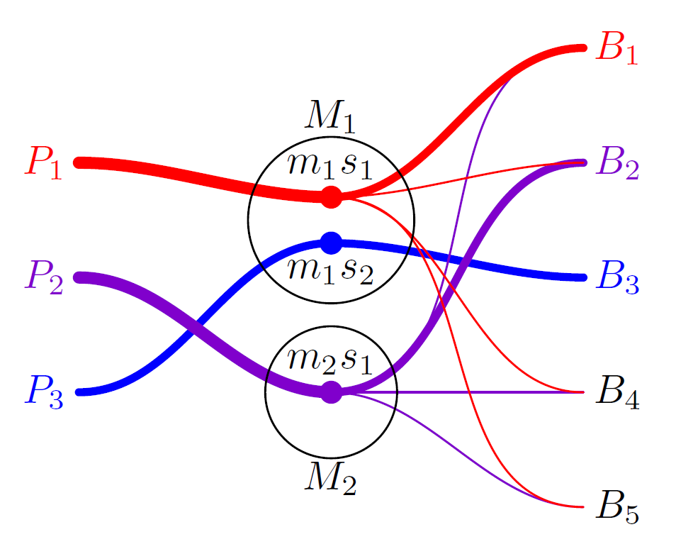
Going back to the more realistic example given above, we can say there are 5 countries in the model. All the countries use a commodity which is produced by three of them (countries 1, 2 and 3). Countries 4 and 5 do not have a domestic production of the commodity and must buy it from the other countries. \(P_1\), \(P_2\) and \(P_3\) are agents that represent countries 1, 2 and 3 aggregate production respectively. Similarly, \(B_i\)s agents represent the countries' aggregate demand. The links between \(B_1\) and \(P_1\), \(B_2\) and \(P_2\) and \(B_3\) and \(P_3\) represent domestic exchanges of the commodity. Because this type of exchange normally concerns most of the production, thicker lines were used to join the market session and buyer in Figure 1. The figure also shows that country 3 does not allow exports or imports. i.e., production is for domestic use and all country commodities are produced internally.
Dynamics
Sequence diagrams are used to give a fast, but effective description of the dynamics. Figure 2 shows the actions the simulator performs in an iteration. Below we will give an intuitive description of the figure’s points 3 and 4, i.e. updating of the buyer’s strategy and the markets operation phases. This allows an overall understanding of the model. A fully detailed description of how the simulator performs all the main loop actions can be found in the CMS documentation.

Buyers update buying strategy
Updating the buying strategy is an elaborate action. This is especially because buyers in the CMS continually attempt both to reduce total expenditure and gather the desired quantity. Complications are mainly due to the existence of multiple provision sources (market sessions) in which supplies and prices continuously change in time. Just to give an idea, consider a buyer having at time \(t\) the situation shown in Table 1. The table shows the buyer's provision sources and their unit cost, i.e. the market price plus transport costs. Now, the buyer is called to evolve its buying strategy. The CMS evolves this strategy in an adaptive way, i.e. a share of the quantity bought is moved from the most expensive to cheaper markets. Suppose this buyer moves 10% of the gathered quantity i.e. 350 units. This implies that demand to \(P_6\) is decreased by 200 and that of \(P_5\) by 150. The demand to less expensive producers is increased by a percentage until 350 is reached. Supposing this percentage is 12%, the \(P_1\) demand is increased by 144, that of \(P_2\) by 60, that of \(P_3\) by 108, and that of \(P_4\) by the residual amount 38.
The last column of Table 1 shows how demand slowly flows to cheaper market sessions. However, in next period the ranking of unit cost could change due to the interplay of supply and demand on the various markets forcing buyers to continuously chase a total expenditure reduction. The CMS accounts for several other factors affecting the distribution of each buyer demand on each market. They include the changing needs of a buyer due to its population and an increase or decrease in economic activity. An additional complication is due to the possible change in the number of market sessions accessible by each buyer due to producers and buyers modification of import-export policies. The reader is pointed to the CMS documentation for full details on how all the particular cases are handled by the simulator.

Perform market sessions
We will now describe the functioning of a market session (see Figure 3 ). To do that, we have to discuss the construction of the market session supply and demand curves.
Concerning supply, we recall that in a market session, the traded items come from a single producer. The market session supply curve therefore corresponds to the producer’s supply curve. Now we need to specify how the producer sets the supply curve. In the present version of the model, the easiest option of a vertical supply curve is adopted: the supplied quantity is independent of price. [1] Despite this simplification, managing the supply policy is tricky when accounting for production that is not realized at every simulation time step and/or for producers who participate in more than one market session in each time step. Even in these cases, the simplest solution is adopted: at the beginning of each market session, the producer checks the level of inventories and divides it equally among the market sessions to come before the production is available.
| Producer | Bought quantity | Unit cost | Target demand in next period |
| P1 | 1200 | 2.25 | 1344 |
| P2 | 500 | 2.50 | 560 |
| P3 | 900 | 2.75 | 1008 |
| P4 | 400 | 3.00 | 438 |
| P5 | 300 | 3.25 | 150 |
| P6 | 200 | 3.50 | 0 |
| Total | 3500 | 3500 |
The demand curve is normally obtained aggregating individual demand curves. As explained above, several buyers attend a session (except when the seller forbids exports). Based on the target levels of demand (see the last column in Table 1) each buyer builds a demand curve for each accessible market session (see the documentation for details on how these curves are built). When two or more buyers attend a market session, their demand curves are aggregated by summing them horizontally to obtain the session demand curve.
Now, using the session demand and supply curves, the market price and traded quantity are computed. The quantity bought by each buyer is obtained using the market price and the individual demand. The diagram in Figure 4, which focuses on a market session (say market session A), can better clarify this.
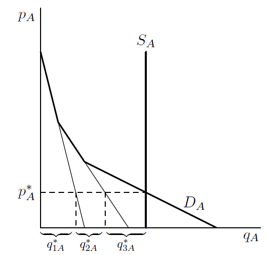
Bold lines are the market session supply (\(S_A\)) and demand (\(D_A\)) curves. For the sake of simplicity it is assumed that there are three buyers in this market. The thin black lines keep track of the horizontal sum of the individual demand curves. The intersection point between the session demand and supply curves (bold lines) determine the market price (\(p^*_A\)) and the total traded quantity (\(q^*_A\)). The quantities bought by each buyer (\(q^*_{1A}\), \(q^*_{2A}\), \(q^*_{3A}\)) are also reported. Obviously \(q^*_A=q^*_{1A}+q^*_{2A}+q^*_{3A}\).
The CMS-Wheat Model
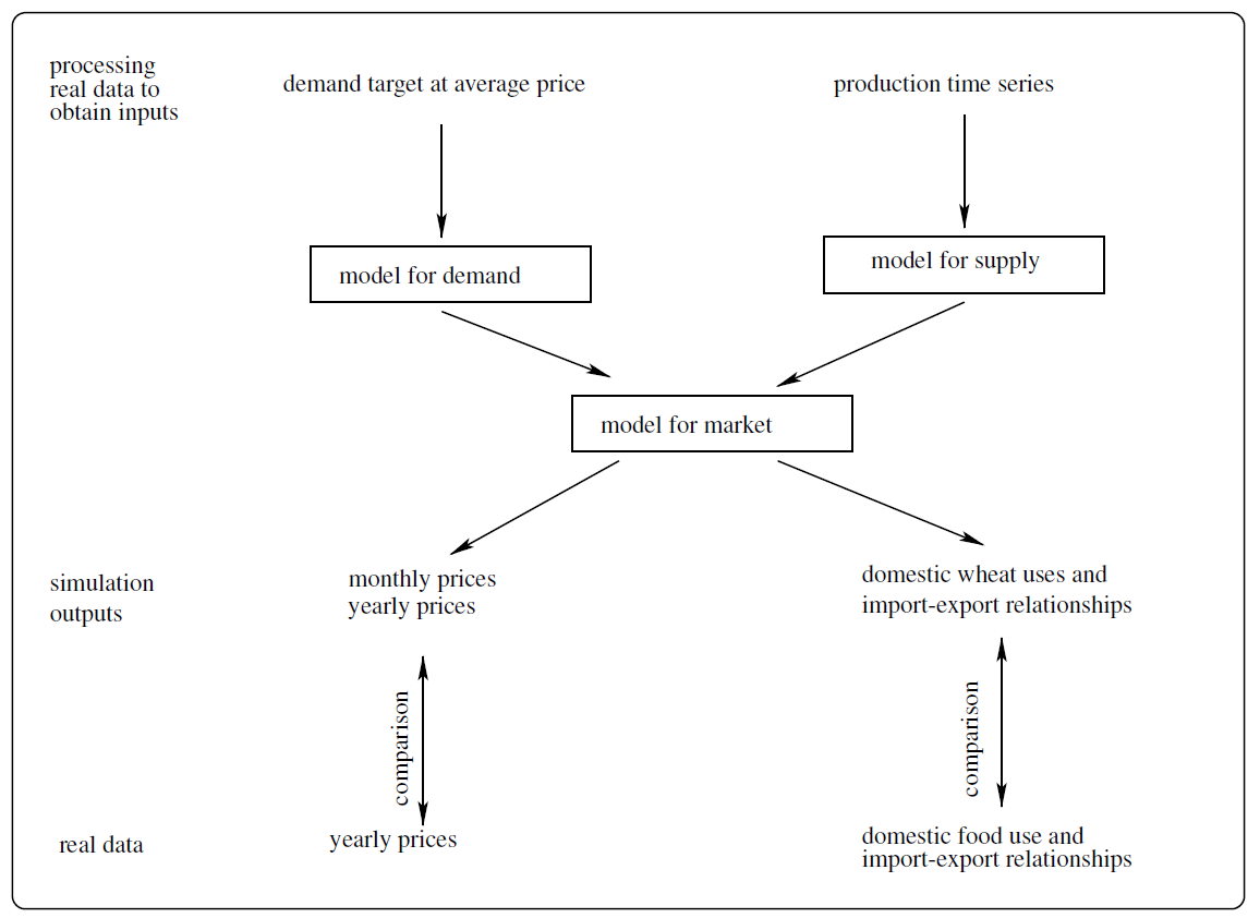
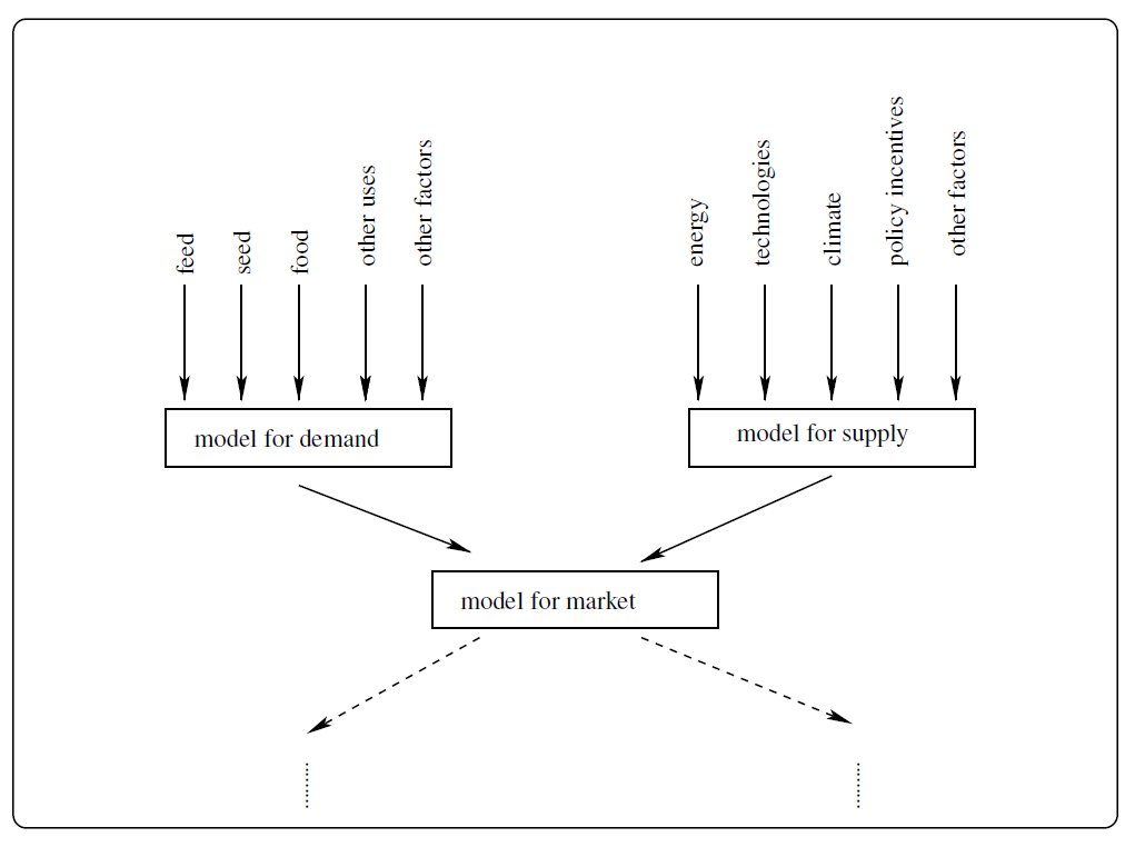
The model whose essentials are presented above needs some specializations to analyze wheat. We adopt a modeling strategy that provides for a gradual introduction of real world elements. A comparison of simulation outputs with the corresponding real world data is a guide to progressively improve the modeling choices and remove the shortcuts taken to keep the initial versions of the model essential and easily understandable. Figure 5 gives a visual representation of the model used in this paper. Following the figure flow, we describe its components below: the real data used as inputs and as terms of comparison for outputs, the modeling choices, and comparison of the model outputs with empirical ones.
Data
We use real world data for i) wheat production and uses, ii) wheat prices and iii) crude oil price. Wheat quantities and prices are from the FAOSTAT dataset while oil price is from World Bank databases.
Details of these data are as follows.
- National and regional time series of yearly wheat production and uses were downloaded from Food Balance section of FAO website (Commodity Balances - Crops Primary Equivalent). This dataset contains time series of “Wheat and products”, that includes Wheat; Flour wheat; Bran wheat; Macaroni; Germ wheat; Bread; Bulgur; Pastry; Starch wheat; Gluten wheat; Breakfast cereals; Wafers; Mixes and doughs; Food preparations, flour, malt extract. For production, the definition of “wheat” given in FAOSTAT is: “Triticum spp.: common (T. aestivum) durum (T. durum) spelt (T. spelta). Common and durum wheat are the main types. Among common wheat, the main varieties are spring and winter, hard and soft, and red and white. At the national level, different varieties should be reported separately, reflecting their different uses. Used mainly for human food”. Given this definition, we jointly model soft and hard wheat since we are unable to distinguish between them. The FAO wheat dataset contains a large set of variables: import, export, domestic supply quantity (production + imports - exports + changes in stocks), food supply quantity, stock variation, feed, other uses, seed, waste. These variables are the component of the wheat sources/uses balance equation on which this paper relies.
To understand the validation procedure implemented in this paper, some detail on the balance equation are given. Formally, the balance equation is the following:
Some specifications on the variables involved might be useful.$$production + import - export + stock\ variation = \\ food+feed+seed+other\ uses + processing + waste$$ (1) - The production variable contained in this dataset is approximately the same as the one in “Crops section” of the FAO Production dataset (Crops).
- According to FAOSTAT definitions, a negative sign in stock variation corresponds to an increase in stock. Stock variation is thus defined as initial stock - final stock.
- Statistical discrepancies make the aggregation of balances equation across world regions and countries inexact (see Appendix A for detail).
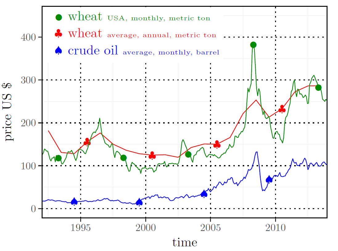
- Yearly time series of wheat prices for most of the producing countries are used to validate the model output. An aggregated time series of yearly wheat price has been calculated averaging prices of selected producers by means of weighted arithmetic mean, where production volume is used as weight. Because real world prices will be compared with our simulation results, the most important prices time series are reported in Figure 6.
- Crude oil price is from the World Bank Global Economic Monitor (GEM) Commodities database. The item has the following description: “Crude Oil (petroleum), simple average of three spot prices; Dated Brent, West Texas Intermediate, and the Dubai Fateh, US Dollars per Barrel”. Data are available in the World Bank website. The dynamics of crude oil price is displayed in Figure 6 together with those of wheat prices.
We will proceed to aggregations and decompositions of quantity data below. It is therefore useful to give information on this topic. Table 2 reports data on the top 20 wheat producers worldwide. Countries were ranked according to averaged production over the period 1992-2013. The table reports the country percentage of world- wide production; the corresponding averaged yield, i.e. hectogram of production per hectare; the averaged land area utilized to grow wheat (Harvested Area). Wheat production of the Top 20 and Top 5 amount to 86.1% and 52% of worldwide production, respectively.
Modeling choices
In this section we retrace the description of the general version of the model given above to discuss the customizations and modeling choices made in order to specialize the model for wheat.
Agents
We set up the simulation to obtain a level of aggregation suitable to investigate international prices formation and traded quantities. In general, we use FAOSTAT regions that are sub-continental geographic areas gathering several countries. However, when a region includes a country (countries) playing a relevant role in the world wheat production/consumption system, we further partition the region to treat the important countries as individual entities (see Appendix A for more details). At the end of this process we end up with the geographic areas highlighted in Figure 7 and listed in Table 3.
| Country | Production (tons.) | World quote (%) | Yield (hg/ha) | Harvested Area (ha) |
| China, mainland | 107553131 | 17.4 | 42086 | 25824041 |
| India | 73447196 | 11.9 | 27135 | 26927187 |
| United States of America | 59837235 | 9.7 | 27908 | 21545498 |
| Russian Federation | 44150970 | 7.2 | 18994 | 23017824 |
| France | 35644793 | 5.8 | 68948 | 5167419 |
| Canada | 25662926 | 4.2 | 25171 | 10271374 |
| Germany | 21493799 | 3.5 | 73073 | 2929144 |
| Australia | 20491377 | 3.3 | 17318 | 11782063 |
| Pakistan | 20197472 | 3.3 | 23860 | 8431478 |
| Turkey | 19623609 | 3.2 | 22346 | 8849862 |
| Ukraine | 17384717 | 2.8 | 28902 | 5903731 |
| United Kingdom | 14614000 | 2.4 | 76715 | 1903574 |
| Argentina | 12798788 | 2.1 | 24752 | 5204802 |
| Kazakhstan | 11906664 | 1.9 | 9883 | 11943083 |
| Iran (Islamic Republic of) | 11256451 | 1.8 | 17610 | 6384640 |
| Poland | 8865031 | 1.4 | 37513 | 2373448 |
| Italy | 7542812 | 1.2 | 34754 | 2185268 |
| Egypt | 6978899 | 1.1 | 61260 | 1130640 |
| Spain | 5662888 | 0.9 | 27102 | 2101009 |
| Romania | 5687618 | 0.9 | 27080 | 2070757 |
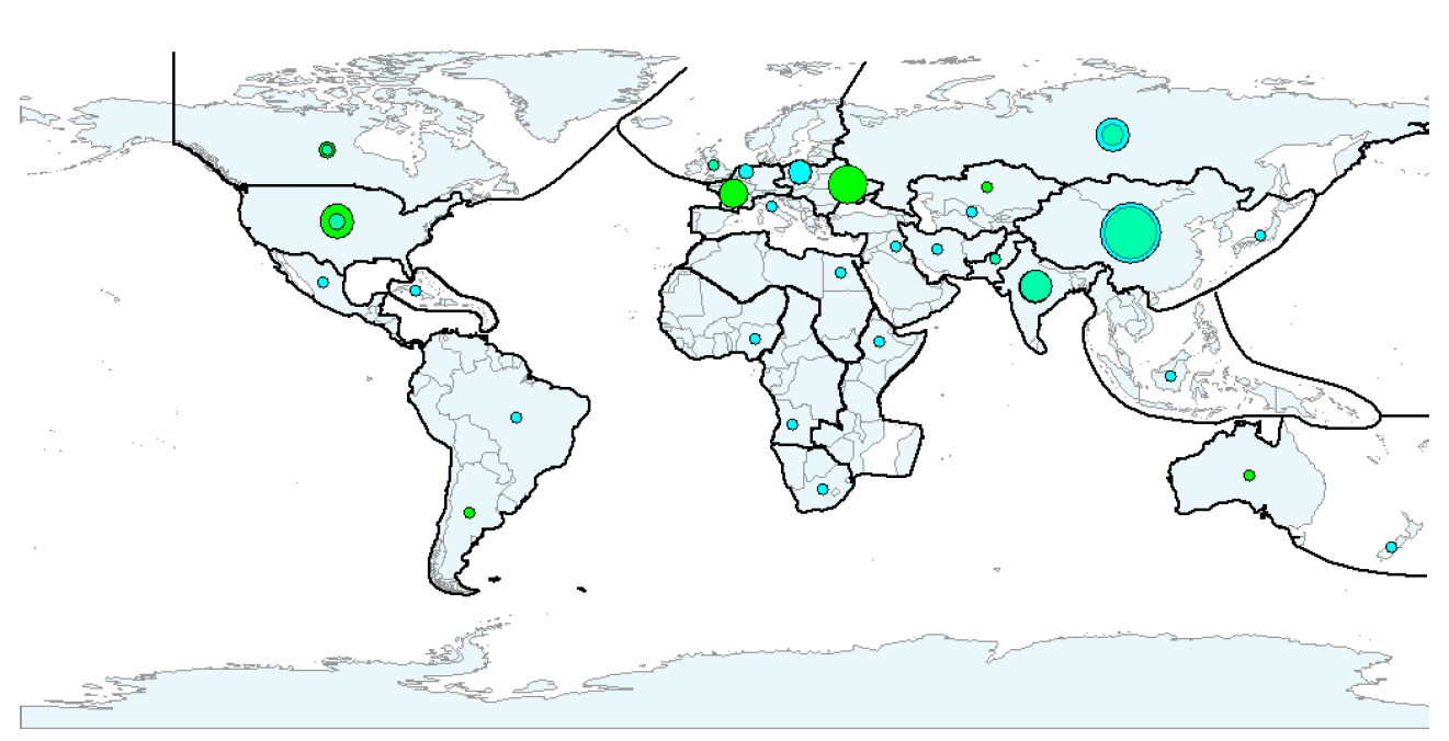
To retain only internationally relevant producers in our analysis and keeping the world supply-demand balance, we proceeded as follows. The net demand was computed for each region as the difference between wheat demand and supply. Regions having a positive net demand in all the years of the time span considered were assumed to consume their production internally. Their production was therefore set to zero and their demand was replaced by their net demand. As a result of this process, the artificial world wheat trade system considered in this study is populated by 12 sellers[2] (those having a “yes” in the "Has an international market session?" column in Table 3) and 24 buyers. For each of these geographic areas, the most important commercial hubs were identified. Again, in Table 3, the column "outgoing hub location" highlights the top producers in each region (see also Table 2 for a complete ranking of these) and the "Incoming hubs location" column reports the top importers of each region. The positions of outgoing and incoming hubs are shown in Figures 7, which also gives information on quantities offered and used by each region.
| Continent | Region | Has an international market session? | Mean harvesting month | Outgoing hub location | Incoming hub location |
| Africa | Eastern | no | Ethiopia | ||
| Middle | no | Angola | |||
| Northern | no | Egypt | |||
| Southern | no | South Africa | |||
| Western | no | Nigeria | |||
| America | Northern - USA Northern except USA | yes yes | 7 6 | USA Canada | USA Canada |
| South | yes | 12 | Argentina | Brazil | |
| Central | no | Mexico | |||
| Caribbean | no | Cuba | |||
| Asia | Southern - India Southern - Pakistan Southern except India & Pakistan | yes yes no | 4 5 | India Pakistan | India Pakistan Iran |
| Central - Russian Federation Central except Russian Federation | yes yes | 7 9 | Russian Federation Kazakhstan | Russian Federation Uzbekistan | |
| Eastern - China | yes | 7 | China | China | |
| Eastern except China | no | Japan | |||
| South-Eastern | no | Indonesia | |||
| Western | no | Iraq | |||
| Europe | Eastern | yes | 7 | Ukraine | Poland |
| Northern | yes | 8 | United Kingdom | United Kingdom | |
| Western | yes | 7 | France | Netherland | |
| Southern | no | Italy | |||
| Oceania | yes | 1 | Australia | New Zealand |
Buyers and sellers interact in a single global market having 12 sessions (one for each producer).
Dynamics
Considering the available FAOSTAT data, the time window for the simulation is set to 1992-2013. The model runs on a monthly base i.e. all market sessions are performed at each simulation time step, while each producer harvests every 12-time steps. Harvesting time is asynchronous and mirrors reality (the harvesting month for each producer zone is reported in Table 3).
The possibility to change import/export policies mentioned in Figure 2 (items 1 and 2) is used, as we will highlight below in the text, to investigate the effect of the 2010 Russian Federation export ban on the international wheat price. Except for this, the model implements a completely open global market environment. In these settings, transport costs are the decisive factor that relates the demand function a buyer sends to a market session with the distance from the producer selling in the considered session. Transport costs per unit of product (c) borne by buyer (say A) to transfer the product bought from producer (say B) home are modeled as follows:
| $$c_{A,B}=a\ kkm_{A,B}+b\ O_p\ kkm_{A,B}$$ | (2) |
Demand
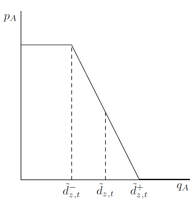
Because individual demand curves management undergoes some changes with respect to the original CMS, we briefly discuss this topic here. In initializing the demand curves position we account for buyer’s and producer’s sizes in order to avoid big countries making too large demands from small producers and vice versa. In this way we set the target level of demand (\(\tilde{d}\)) which is the quantity demanded at the average price level (see Figure 8).[3] We then set the slope of the demand function in such a way that the demanded quantity increases by a given percentage (the parameter \(\delta_D\)) when the price equals zero. Therefore, the demand curve is a straight line going from \(\widetilde{d}^-:=\tilde{d}(1-\delta_D)\) to \(\widetilde{d}^+:=\tilde{d}(1+\delta_D)\) as displayed in Figure 8. Furthermore, there is a level of price \(\bar{p}_z\) above which the wheat is out of range because it is too expensive for the country. We set this threshold equal across buyers in order to keep the model simple.
Demand curves continuously move in time to allow buyers to gather the desired quantities at the lowest price. These desired quantities (\(\tilde{d}\)) change in time and are not endogenously determined i.e. they are inputs for our model. Understandably, they are not included in any database. We therefore decided to infer them from the FAOSTAT data using a calibration procedure that is better described below and in the Appendix.
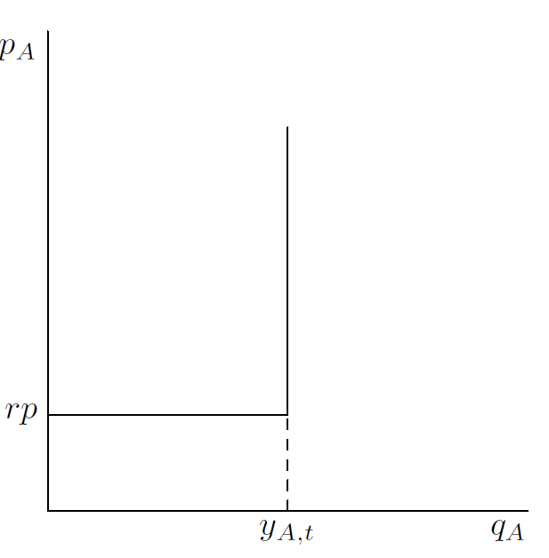
Supply
In order to keep the wheat variant of the model simple and in line with the general version presented above, we used a vertical supply curve. In addition to the basic model, a reserve price below which the producer is not willing to sell was introduced. The reserve price (\(rp\)) is given by:
| $$rp=a_{rp}+b_{rp}\ O_p$$ | (3) |
Market equilibrium and disequilibrium
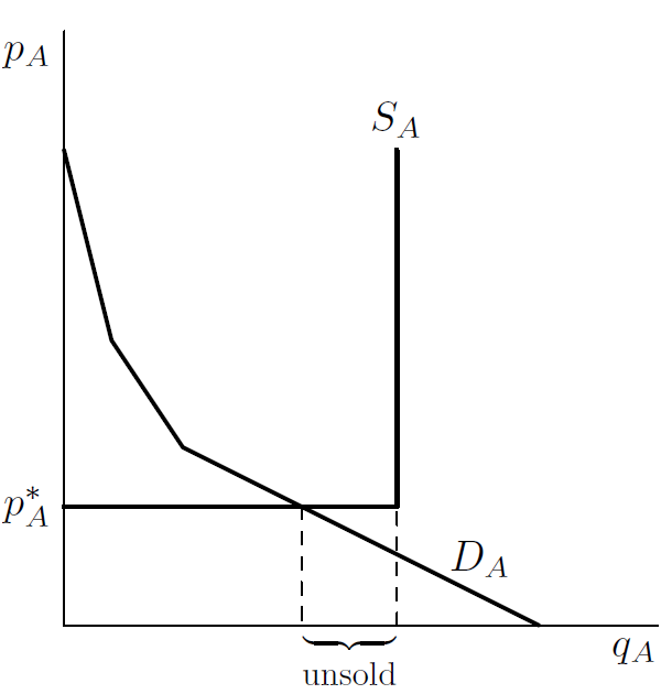
The modifications to the demand and supply curves just described above give the possibility to observe market disequilibrium even in the centralized market structure used in this model. A market is in equilibrium when the intersection point belongs to the downward section of the demand curve and vertical section of the supply curve. This situation is basically the one already seen in Figure 4. One possibility of disequilibrium is characterized by intersection points belonging to the horizontal section of the supply curve. This happens when the demand is too low compared with the quantities offered. Because this is a situation observed in our simulations, we report it in Figure 10. In this case, as displayed in the figure, producer countries do not succeed in selling the whole quantity offered on the market. In another form of market disequilibrium, buyers leave the market without the quantity they wish. If heterogeneous \(\bar{p}_z\) are considered, the market demand curves have horizontal sections (especially at high prices). Buyers rationing happens if the intersection point falls in one of these portions. Furthermore, it can happen that the market price is higher than some buyers’ upper price threshold \(\bar{p}_z\). Therefore, these countries do not buy any wheat. However, our simplification of homogeneous buyers upper price threshold excludes the realization of this case in our simulations. Other forms of market disequilibrium, such as those due to decentralized market structure, cannot be observed either in our simulation. These two cases represent opportunities for future developments of the model.
Parameters calibration procedure
The model has several parameters. Setting some of them is straightforward or can be done using economic deductions. A calibration procedure has been implemented to set the other parameters. This calibration procedure combines two techniques: the differential evolution algorithm and a variant of the gradient method. Details are provided in Appendix B.
Results
The model outputs 12 prices and all the traded quantities among the 12 producers and the 24 user regions at monthly frequency. This is a large amount of data which is much more than the available real world data. The main feature of the proposed model is that it endogenously generates the dynamics of prices and quantities. It also accounts for prices-quantities interaction in the generation process. To our knowledge, no other study has these characteristics: they either analyze prices or quantities. The majority of studies focus on understanding the price formation process keeping exogenous quantities. This is mainly because wheat is the main staple foodstuff and avoiding sudden increases in its price is desirable. The issue of price level and volatility mainly affects poor countries where it is used in a roughly processed way.
On the quantities side, the trade network evolution of a single commodity is a new field of study which attracts attention. However, prices have very small role in these types of investigations. These studies highlight how the network is in continuous evolution. Arguably, globalization and new information and communication technologies cause a long-term tendency to a growing and more connected trade network bringing potential benefits for all countries. Political choices or negative events (such diseases, epidemics, natural disasters, diplomatic incidents and so on) often oppose this tendency by destroying trading relationships. Countries are therefore forced to bear the costs of the rearrangement in their relationships.
The model presented in this paper allows the dynamics of both prices and trade quantities to be jointly monitored. In presenting our results, we will first show how the model is able to replicate the basic features of the trade network and prices. We then discuss one of the many possible applications of our model. In particular, we aim at evaluating the effects of a negative event that destroys some links in the network. A natural experiment for this is the 2010 Russian Federation export ban.
We highlight that the calibration process we implemented was aimed at replicating prices. Our results have therefore more qualitative nature with respect to the trade network, while we can give precise quantitative results concerning prices.
Trade network structure
By using simulation output, we can compute for each region the quantity bought in the domestic market session, the quantities bought from each of the other producers, and those sold to each buyer. It is thus possible to compute the import and export time series on a monthly time scale and obtain the corresponding annual series by summing up every 12 periods. This aggregation allows for stimulating exercises by qualitative comparison of simulated and real data. Three of these exercises were performed: i) long-term commercial relationships via graph visualization, ii) dynamics of trade via geographic maps and iii) time series comparison. All these exercises derive from the possibility of building the network of international exchanges and tracing the dynamics of such a network. As highlighted above, this is a recent topic of investigation (Barigozzi et al. 2010; Fair et al. 2017). The outcomes of these exercises are reported and discussed below.
Long-term commercial relationships via graph visualization
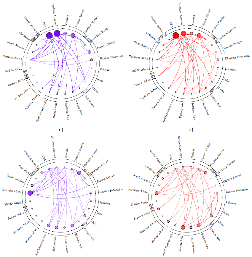
We use a circular graph layout to assess whether the model grasps the most important commercial relationships in the long run. We proceed by summing the quantities traded in the whole time span (22 years) by each pair of regions. These figures are arranged in a matrix. We then transform this matrix into an adjacency matrix by replacing the highest \(n\) figures with 1 and setting the rest to 0. Proceeding in this way for both FAO and simulation data, we obtain graphs with an identical network average degree (i.e., the number of edges divided by the number of nodes) which are therefore fully comparable. Both real world and simulated adjacency matrices are then visualized using a circular layout whose node sizes are proportional to their out-degree (in the case of exports) and in-degree (in the case of imports). The four graphs at a network average degree of 1.5 are shown in Figure 11.
By looking at the graphs, it is possible to see at a glance how the model fits the most important real world commercial relationship. USA, North America, Western Europe, Oceania, Eastern Europe and Russian Federation are the main exporters in both real and simulation data (see graph a) and b) in Figure 11). On the import side, Northern Africa, Southern Europe, China, Western Asia and Eastern Asia have a primary role in both real data and simulations. Instead, simulated data underestimate the role of South-Eastern Asia with respect to the real data counterpart.
Dynamics of trade via geographic maps
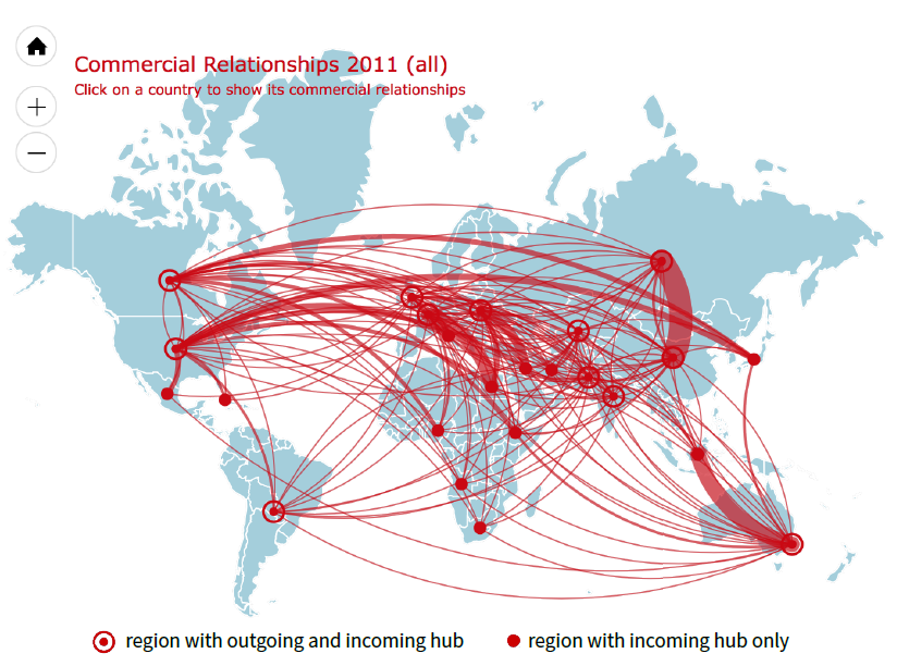
A second exercise is that of drawing lines between sellers and buyers using a world map. With respect to the analysis described in the previous section, we avoid pooling the relationship of all years and opt for visualizing the commercial relationships that occurred in a single year. Consider Figure 12 as an example. The figure provides a visual representation of the international exchanges generated by the model in 2010. We recall that, in this type of representation, flows move clockwise. In other words, a node A provides resources to a node B if moving from A along the line to B implies a clockwise movement. Some examples can help in clarifying this. According to Figure 12, South-Eastern Asia imported a relevant amount of wheat from Oceania (note the counter clockwise outer direction of the edges starting from Indonesia), while United States and Canada exported to several other regions (clockwise outer direction of many lines exiting from these two countries).
A comparison of maps in subsequent years shows how the scenario changes year after year. For example, the map reported in Figure 12 can be compared with that in Figure 13 in order to understand how the trade network evolved from 2010 to 2011. Unfortunately, it is difficult to describe these dynamics in an article. To overcome this difficulty, we use digital technologies to provide companion web pages. The reader can point the browser to the following URL: http://erre.unich.it/wheat_map/ to have a dynamic presentation of the trade network generated by the model. The web page displays a set of 25 short movies (gif format) continuously cycling among the maps of all the considered years. The first movie, displays the link among all 24 considered regions. Scrolling down the page, one can observe the dynamics of the links of each single region. Furthermore, by clicking on one of the years reported at the top of the page, one obtains an interactive trade network for the chosen year. It is possible to show the commercial relationship of a given region by clicking on the corresponding node.
According to this dynamic representation, the simulation generates a vivid network structure where links continuously appear and disappear. However, these observations deserve deeper studies in the future in order to better assess the dynamic features of the network and how it responds to shocks.
Time series comparison
Performing some aggregations in the FAO data (details of which are given in Appendix C), we compute several quantities that can be compared with simulation outcomes. We focus our attention on the quantity used by each region because it contributes to the well-being of the population, especially in poor countries. The FAO dataset supplies this quantity. As we highlighted above, our calibration process identifies a time series of target quantities for each region. These quantities are strictly tied to the quantity used because in simulations, each region acts adaptively to gather the target quantities in the accessible markets. However, quantities obtained in the simulation output often differ from the target because buyers can fail to obtain the desired quantities in the markets.

The comparison of these three variables (real, simulation output and simulation input) provides an opportunity to evaluate the performance of the model on the quantity side. Figure 14 shows the dynamics of these three variables for the United States to provide an example. Due to limited space, we built an additional web page showing the charts for all the other regions. Its URL is: http://erre.unich.it/wheat_map/bought_png.html. The chart shows the dynamics of the quantity obtained in all the market sessions, both domestic and foreign, hence the heading “bought quantities”.
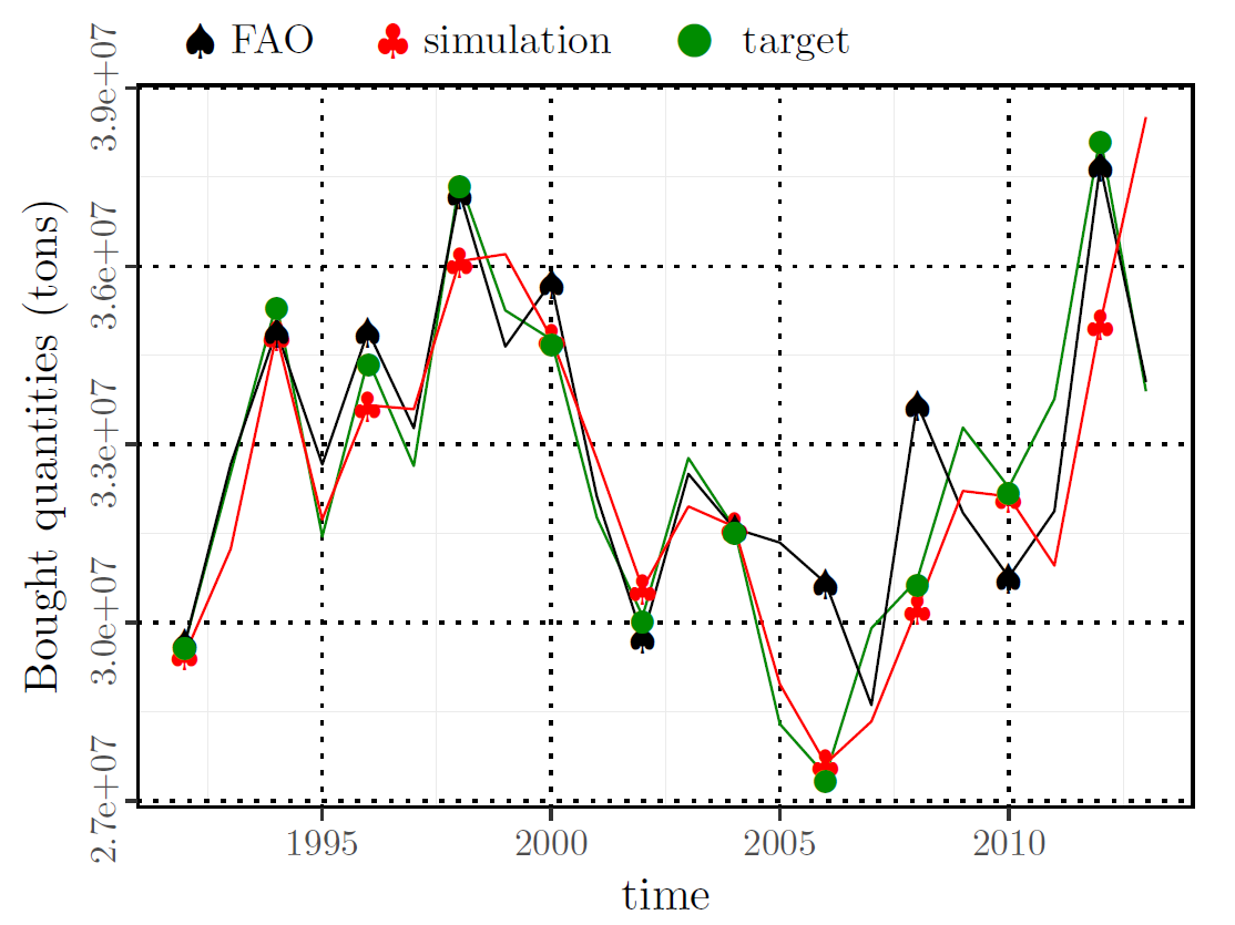
The charts show how the dynamics of simulated quantities is generally compatible with those observed for all the considered regions. However, we expect possible improvements in the future by giving weight to quantities in the calibration objective function.
Price Dynamics
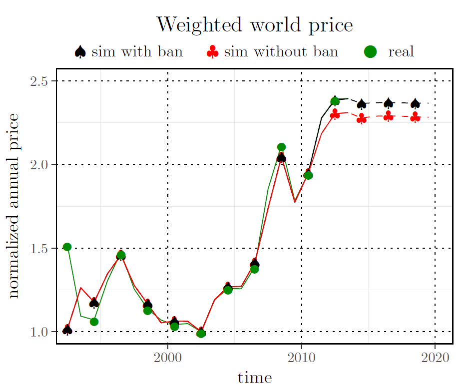
The comparison between simulation output and real world data is straightforward for yearly prices because they are fully available for each country. Figure 15 compares simulation outputs with the weighted average price of the 12 producer countries. The weight is given by the share sold by the country with respect to the sum of the total quantity sold. As already mentioned, both prices and sold quantities are available in real world data at yearly frequency. Simulations instead provide monthly values. Therefore, yearly aggregation is computed from simulation data by first calculating the monthly weighted prices and then averaging them every 12 periods. Since simulation unit measure for prices differs from the real data one, we normalize the values. The normalization was done dividing each time series by its own minimum value. Figure 15 shows the yearly weighted world price fit. The prices observed in real data are accurately reproduced by our model. Although this is a consequence of the calibration procedure described above which has the objective of minimizing the distance between simulated and real prices, this result signals that the model grasps the essential elements of international wheat exchanges.
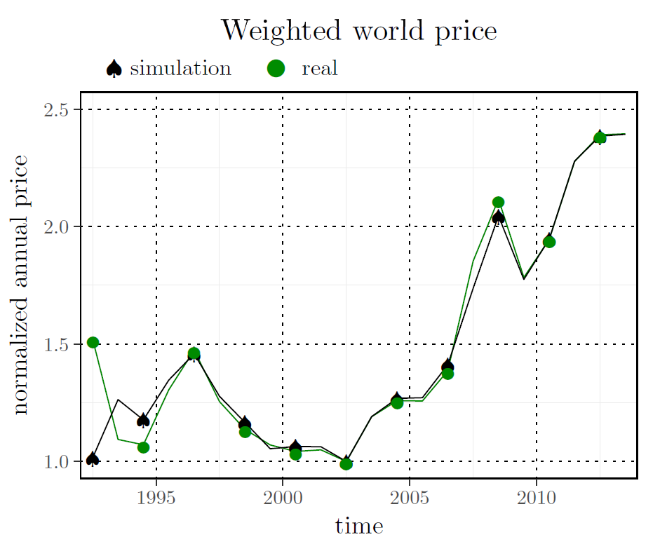
The results of this investigation provide an interesting insight into the modeling of the global price of wheat. The two sharp peaks in 2007/2008 and 2010/2011 are faithfully reproduced also if they are specifically due to investor speculations that are not strictly accounted in our model implementation. Conversely price decline and stagnation at the end of last century and before 2008 were well reproduced. The model, which is generally satisfactory, does not account for the first year of simulation due to the complexity of the simulation initialization phase. We set up the simulation using 1992 data and let the system evolve with these input values. After simulation output stabilizes, we make the simulation load new inputs at each time step. Therefore, when the simulator starts loading inputs, the system is in a state comparable to the 1992 equilibrium. As highlighted above, real systems are not normally in equilibrium. The gap between simulation outcome and FAO data in 1992 therefore reflects the different states of the two systems: equilibrium in simulations and out of equilibrium in FAO data. As the simulation progresses, the artificial system gradually enters the disequilibrium state comparable to the real world’s and the two prices get closer and closer.
Assessing the effects of the 2010 Russian Federation export ban
One of the most challenging uses of the model presented in this paper is the evaluation of policy choice effects both on wheat prices and traded quantities. The Russian Federation export ban mentioned in the introduction (section 1.7) provides an occasion for this.
In 2010 a severe climate anomaly in Eastern Europe caused many impacts related to heat-waves (Barriopedro et al. 2011), wildfires (Lioubimtseva et al. 2013) and air pollution (Konovalov et al. 2011). In particular, the Russian Federation, Kazakhstan, and Ukraine (all three amongst the world’s top-10 wheat exporters) suffered the worst heatwave and drought in more than a century, while the Republic of Moldova was struck by floods and hail storms (Arpe et al. 2011; Winne and Peersman 2016). In addition, from early July to September a large crop production area was hit by wildfire with significant losses and grain yield in the Russian Federation was reduced by a third (Lioubimtseva et al. 2013). However, the story of the Russian Federation ban needs to be explained starting from the framework of operator expectations. Based on previous years’ performance, optimism about the upcoming harvest was high early in 2010: in May 2010, the Russian Grain Union predicted that the harvest might reach 100 million tons, revised down to 90 million tons in mid-June 2010. This lower forecast represented a 7% decline from the 2009 harvest, but would still be sufficient to meet domestic demand and allow grain exports. On the basis of these forecasts, officials in Russia’s grain industry predicted that grain exports would exceed 20 million tons for the 2010-2011 agricultural year, and lobbied the government to become more active on the world grain market and to increase exports even more (Wegren 2011). However, by the end of July 2010, as soon as the climate effects on production became more obvious, the original forecast for a 90 million ton harvest was revised significantly downward (the last report was 60 million tons). When it became clear that the harvest would be much smaller than in 2009, the market reaction was an immediate spike in grain prices (Financial Times 2010a). One of the first actions the government took when it became clear that drought and heat would significantly affect the harvest was to attempt to calm the domestic market by enhancing domestic supply. At the end of July, the Russian government released three million tons of grain from its reserves. Then on August 15, 2010 the Russian Federation announced a ban on grain exports that would stay in effect until the end of 2010 (Financial Times 2010b). However, this was subsequently extended to the following summer harvest as continued hot weather in autumn looked as if it might have damaged planting and lowered returns for 2011 (OECD 2011). The export ban was initially enacted to impede speculation and price hikes on bread and grain products on the internal market, but instead the ban proved to be ineffective in stopping food inflation and wheat price increase at local and global level.
As explained above, import/export policies can be managed in our model. This gives us a chance to observe how the system would have evolved if the export ban had not been imposed. It is worth mentioning that because the ban happened in the real world, it was active in our model during the calibration process. Using the calibrated parameters, the model was run two additional times: with the Russian Federation export ban enabled and disabled. Furthermore, the model outputs the projection of prices for the following years. They are obtained under the simplification that produced and demanded quantity keep constant at the 2013 levels.
The outcome of this exercise can be evaluated looking at Figure 16 which shows the two time series already reported in Figure 15 and an additional one showing that wheat average world price would have been significantly lower in 2011-2013 if Russian Federation had not imposed the ban (red line). Precisely, in 2013 the normalized observed (green line) and simulated with ban (black line) prices are basically the same and equal to 2.395. The normalized price in the simulation without ban (red line) is 2.31, with a -3.55% deviation from the observed price. The price simulation without ban confirms the uselessness of the ban while the general price increase is due to net supply shock between what was declared early in 2010 and what happened later (Wegren 2011; Adjemian et al. 2014). In this way, predictions of a poor harvest in the Russian Federation lead to dramatic increases in purchases and prices, even though this drop in production would not have a dramatic impact on global supply. This then triggers export bans in exporting countries, which in turn makes importers even more nervous and so generates a self-fulfilling prophecy (Welton 2011). This may also help to explain the persistence of high prices as shown in Figure 16 with and without the ban. Moreover, the ban on grain export had various short and long- term consequences. The ban had immediate implications on the Russian Federation’s traditional wheat trading partners, forcing them to source alternative supplies (see Figure 12 and Figure 13). According to the model, the export ban has modified the Russian Federation trading relationships. Figure 13, for example, makes clear the relevant increase in the Russian Federation-China trading relationship in 2011. Looking at the supporting material at http://erre.unich.it/wheat_map it is possible to see how this link gradually normalizes in the following years. Finally, in terms of longer-term impacts, the grain export ban has arguably created a framework where price spikes and uncertainty are far more likely in the future (Welton 2011).
Conclusions and Further Developments
The literature on the mechanisms of food price volatility is extensive and a number of studies have recently analyzed the main factors to be taken into account in the implementation of an economic model for commodities (Tang and Xiong 2010; Wegren 2011; Lagi et al. 2015; Rutten et al. 2013). Thanks to the extensive literature search performed by Lagi et al. (2015) on the causes of the food price crisis of 2007-2008, the factors that emerge with greater importance are: climate, diet, exchange rates, energy costs, ethanol and speculation. Lagi et al. (2015) found that the last two parameters are the ones that most influence the market: ethanol conversion resulting in a smooth price increase, whereas speculation results in bubbles and crashes. In our model, exchange rates and energy costs are strictly connected to the oil price, while diet is included in the FAO dataset (feed, food and other uses). Ethanol is mostly extracted from other crops and residues, mainly sugar and maize (OECD-FAO 2012); the latter exhibits a positive correlation during the last 20 years, suggesting that the majority of the time both maize and wheat prices move together (Musunuru 2014).
As concerns speculation, this can be divided in two types: (i) passive speculation associated with commodity index traders (CITs) and (ii) more traditional speculation based on anticipation of future supply and demand shocks in a single market (Adjemian et al. 2014). The latter has not been accounted for in our model, whilst the former is strictly related to actual supply-and-demand discrepancies (Musunuru 2014; Lagi et al. 2015) that are modeled in changing inventories on the monthly bases as a proxy for storage market dynamics (Garcia et al. 2014; Adjemian et al. 2013).
Within the factors that are responsible for volatility of wheat and food prices it emerges that speculation and related policy inaction can be contrasted by the inclusion of detailed information on the climatic conditions foreseen for the major players in the global market (exporters and importers). In fact, after the food crises in 2007/2008 and 2010/2011, two major tools for monitoring global agriculture were launched and have been operating to aid food agencies worldwide in responding more efficiently to such shocks, based on the Group of Twenty (G20) Cannes Summit Final Declaration (G20 2011). One is food price monitoring based on government agricultural statistics, as represented by the Agricultural Market Information System (AMIS) (Delincé 2017). Another is crop condition monitoring using satellite remote sensing, as exemplified by the Global Crop Monitor (GEOGLAM 2017). The contributions from satellite data and food price statistics in monitoring food insecurity are tremendous (Brown 2016). However, as the main objective of these tools is monitoring, global yield forecasting based on seasonal climate forecasts represents an independent and complementary source of information to be linked with food market models (Iizumi et al. 2018).
Traditional analytic techniques find it difficult to take into account such a variety of events. This work is a first step to take advantage of the computational techniques to handle all these factors. In particular, we aim at building a tool for analyzing the dynamics of cereals prices and traded quantities under alternative economic, environmental and climate conditions.
In this paper, we have specialized the structure and the dynamics of an existing model for the generic analysis of commodities (the CMS model) to the wheat case. Changes are formulated in accordance with the economic determinants of agricultural productions. Our variant of the original software is called the CMS-Wheat simulator.
The careful model calibration we implement, together with the inclusion of crude oil price allow replication of empirical yearly weighted world price. On the quantity side, we have obtained promising results though further model building is needed.
The model can be developed and improved in several directions.
Figure 17 reports the top part of Figure 5 with some integrations to highlight possible model developments. These developments involve either the demand (differentiating by the utilization of cereals) or the supply side (conversion to biofuels, seasonal to decadal climate effects, technical levels, policy incentives, etc.).
In particular, we think climate factors of primary importance in the further development of this work. We plan to develop the model to include climate variability forcing that is acting on wheat yields as a primary exogenous factor. The combination of global scale climatic forcing, e.g. the El Ninõ-Southern Oscillation (ENSO), and local scale climatic characteristics, such as a period of drought, could modulate price dynamics or even produce shocks in the global market with relevant impacts. Iizumi et al. (2014) and Gutierrez (2017) find that large-scale atmospheric dynamics affect local crop yields. Following this insight, we are presently running linear regressions in order to identify the effect of the ENSO on wheat yield of the top 20 producers worldwide. Preliminary results are encouraging: on average, we find 6-7 significant effects for each considered country (for a total of 138 significant relationships). All this will improve the modeling of wheat supply.
Another important factor that will be taken into account is the stock management of cereals that directly affects international price. Traditionally stock-holding has been a private as well as a public activity. Private operations in this field are linked to the possibility of speculation based on future price expectations. Instead, Government agencies usually adopt a price band to balance supply and demand and to contain price volatility. Management of the stock is strictly connected to the availability, access, utilization, and stability of food. It could represent a policy tool to reduce malnutrition in the poorest countries.
All these developments will improve the model performance. It could therefore be used as a tool for producing reliable forecasts of prices and quantities at both global and region/country level. Another important goal of the model is to give recommendations about prevention policies that most reduce the negative effects of extreme events, emergency measures that imply less sacrifice for the population and measures to reduce the price volatility.
Acknowledgements
This study was partially developed in the framework of VOPA Project (VOlatilità dei mercati e Produzioni Agricole: interazioni fra variabilità climatica e sviluppo tecnologico delle nazioni nei meccanismi di formazione dei prezzi dei prodotti alimentari) and MACSUR (Modeling European Agriculture with Climate Change for Food Security - www.macsur.eu) - phase 2 Project and MED-GOLD - Turning climate-related information into added value for traditional MEDiterranean Grape, OLive and Durum wheat food systems (EU - 776467). We thank the developer of the amchats library with which map pictures are realized. The comments of two anonymous reviewers contributed to significantly improve a first version of this article. Remaining flaws are the authors’ responsibility.Notes
- Although simple, this strategy is effective in modeling perishable goods or when warehouses must be empty to store the new harvested goods.
- Note that the 12 outgoing hubs are in the top 14 worldwide wheat producers listed in Table 2. The two missing top 14 producers are Germany and Turkey. Germany was excluded because it is second to France in the Western Europe region. Turkey was not considered because it belongs to the Western Asia region which is a net importer and therefore does not have an outgoing hub.
- For computational ease, demand curves are defined in a given price range, namely 0-10, therefore the average price level is 5. Given this simplification, we will rescale both simulated and real prices in order to make a comparison as will be clarified in the results section.
Appendix
Appendix A: Replicability and code availability
The model used in this paper is available at the following link: https://github.com/gfgprojects/cms_wheat.Both the source code and documentation are available to anyone who wishes to replicate the results or develop the model. Furthermore, the scripts folder provides all the R scripts (R Core Team 2018) used to generate the inputs for the model and for analyzing the simulations outcomes.
The FAOSTAT dataset provides three levels of aggregation: country, regions and special groups. Our data preparation process starts from the regions level. Regions are aggregations of countries. The regions level has itself three levels of aggregation. The first concerns partition of continents that include several countries. We will refer to this as the sub-continental level. The second reports data from continents and the third has data at world level. We started preparing the data using sub-continental data from Europe, Asia, Africa and the Americas and we directly took continental data from Oceania. Because some important producer countries deserve an individual treatment we further partitioned sub-continents to explicitly account for them. As shown in Table 3, North America was broken down into the United States and its complement; Southern Asia in India, Pakistan and its complement; Eastern Asia in China and its complement; Eastern Europe into the Russian Federation and its complement. This process led us to partitioning the world in 24 geographic areas. Each component of the wheat balance was recorded in a text file (.csv file extension). These files have 24 lines each of them relating to one geographic area. They are stored in the scripts/generate_inputs/data folder. These data are further manipulated to obtain the files that are supplied as inputs to the ABM. The scripts/generate_inputs folder includes the R scripts which perform such manipulation and write files to the data folder where the ABM reads inputs.
The motivation for this manipulation is that data recorded by FAO are the outcome of market bargaining. Our model simulates markets functioning and delivers the outcome of market bargaining. FAO and simulation results can therefore be compared. Hence, FAO data cannot be used directly as inputs for our model, but they can be used to obtain wheat demand and supply which are the required inputs for the model.
A strategy would be to build a model for each of the balance components, i.e. a crop model for production, a selling strategy for the stock change and so on. However, this is a very demanding task that presents various difficulties. Consider for example the food component of demand. It is straightforward to think that its main determinant is population, however real data show how the dynamics of population and the food component moves in a totally different manner in several countries. While building a model for each component of FAO balances is a valuable strategy in the long run, in this paper we adopt a method allowing us to obtain demand components in a relatively easy way.
The idea behind the method was triggered by a check on FAOSTAT balances. If a sum over the balances of all the zones is performed, supplied and used quantities must coincide at global (world) level. This check revealed a systematic deviation of supplied and used quantities as shown in the left chart of Figure 18. This deviation is mainly due to accounting problems concerning internationally traded goods (Malović 2013). In fact, at the global level, total imports and total export should coincide. This equality is not respected in the data. In the following we will introduce a formal notation where we use capital letters to denote yearly quantities supplied by the dataset. The global net import in year \(t\) (\(GNI_t\)) is defined by:
| $$GNI_t=\sum_z (IMP_{z,t}- EXP_{z,t})$$ |
More precisely, if we compute the world supply in a given year \(t\) as \(Y_t=\sum_z Y_{z,t}\) and the world demand as \(D_t=\sum_z D_{z,t}\) we have
| $$Y_t-D_t=-GNI_t$$ |
The unbalance at world level is shown in Figure 18.
We can now mine the data in order to ensure that world supply equals world demand, i.e \(GNI=0\) in each period. Starting from
| $$Y_t-D_t+GNI_t=0$$ |
| $$\hat{Y}_t-D_t=0$$ |
Therefore
| $$\hat{Y}_t=Y_t+GNI_t=\left(1+\frac{GNI_t}{Y_t}\right)Y_t=\left(1+\hat{\eta}^y_t\right)Y_t$$ |
| $$Y_t-\hat{D}_t=0$$ |
Therefore
| $$\hat{D}_t=D_t-GNI_t=\left(1-\frac{GNI_t}{D_t}\right)D_t=\left(1+\hat{\eta}^d_t\right)D_t$$ |
The discussion in the previous section shows that we can modify data in order to achieve a given result. In this case the goal was to obtain \(GNI_t=0\). This also provides a method to go back from FAO balance data to the unknown level of supply and demand. In this case, we choose the goal of replicating the yearly weighted world price. We therefore undertook to find supply and demand percentage deviations that would make the model to achieve the goal better. We will denote these deviations as \(\tilde{\eta}^y_t\) and \(\tilde{\eta}^d_t\). We adopt the simplification \(\tilde{\eta}^y_t=0 \ \forall t\) because supply is strongly influenced by production. We therefore focus on the \(\tilde{\eta}^d_t\)s.
Once the value of \(\tilde{\eta}^d_t\) have been set, we compute the desired demand for each country by computing the following value
| $$\tilde{D}_{z,t}=(1-\tilde{\eta}^d_t)D_{z,t}$$ |
Based on the comparison between \(\tilde{D}_{z,t}\) and \(Y_{z,t}\) we partition regions in two sets: the net international buyers set and its complement. A region belongs to the net international buyers set if \(\tilde{D}_{z,t}\ge Y_{z,t} \ \forall t\). The idea behind this classification is that all the production of a net international buyer is for domestic use. A net international buyer therefore does not have a commodity to be sold to other countries, hence it does not have an international market.
Thus, regions are partitioned into the sets of net international buyers and international suppliers. International suppliers organize international markets where they offer their production \(Y_{z,t}\). Instead, international suppliers direct their demand (\(\tilde{D}_{z,t}\)) to their own or other international markets. Net international buyers direct their net demand \(\tilde{D}_{z,t}-Y_{z,t}\) to international markets.
This process allows us to reduce the number of international markets and to sift the market maker. The r_reduce_number_of_producers_food.R script transforms the aggregated data reducing the number of producers. The script outputs several files in the data folder. These files are loaded by the code in order to set up the simulation.
It is worth noting that the values of \(\tilde{D}_{z,t}\) are given as input to the model and can be viewed as a country’s desired quantities at an average price. The yearly data are then transformed in monthly \(\tilde{d}_{z,t}\) values by the software at initialization time. Theobservedexchangesareingeneraldifferentfromthosebecauseabuyerwillbuyahigher (lower) quantity if the price is low (high).
Appendix B: Parameters calibration
The model has several parameters whose description is provided in the documentation. The most important of them are reported in Table 4. The table also signals which of them were set using special techniques (* identify parameters that were calibrated using the differential evolution algorithm).
| Parameter | Notation | Value | Reference |
| Production cycle | \(\tau\) | 12 | see documentation |
| Tolerance in moving demand | \(\iota\) | 0 | see documentation |
| Fix cost in reservation price | \(a_{rp}\) | 1 | in Equation 3 |
| Slope in reservation price | \(b_{rp}\) | 0.02 | in Equation 3 |
| TransportCostsTuner slope | \(b\) | 0.01 | in Equation 2 |
| TransportCostsTuner intercept* | \(a\) | 0.05 | in Equation 2 |
| ShareOfDemandToBeMoved* | \(m\) | 0.1 | see documentation |
| PercentageOfPriceMarkDownInNewlyAccessibleMarkets* | \(d\) | 0.05 | see documentation |
| DemandFunctionInterceptTuner* | \(\bar{D}_{b,0}\) | 0.5 | see documentation |
| DemandFunctionSlopeTuner* | \(\delta_D\) | 15 | in Section 3.10 |
In addition, as hinted above and better explained in Appendix A, we infer the desired demand of each region starting from the observed level of exchange found in the FAOSTAT dataset using the following equation
| $$\tilde{D}_{z,t}=(1-\tilde{\eta}^d_t)D_{z,t}$$ |
We therefore need to calibrate the \(\tilde{\eta}^d_t\).
Parameter calibration is driven by the objective of yearly price replication. Two different techniques are used for \(\tilde{\eta}^d_t\)s and for \(a,\ m,\ d,\ \bar{D}_{b,0}\) and \(\delta_D\). These two techniques are nested in a recursive procedure. The \(\tilde{\eta}^d_t\)s are initially set to 1 and the last five parameters reported in Table 4 are set by running the differential evolution algorithm. Once these parameters have been set, a new configuration of \(\tilde{\eta}^d_t\)s is searched by running an algorithm inspired by the gradient method. The procedure is as follows. After a model run, yearly prices \(\tilde{p}_t\) are computed. If the price from the simulation output is higher than the real price in a given year, the \(\tilde{\eta}^d\) for that year is increased. \(\tilde{\eta}^d\)s are simultaneously updated as follows:
| $$ \tilde{\eta}^d \leftarrow \tilde{\eta}^d+\left(\frac{1}{1+e^{-\beta(p_t-\tilde{p}_t)}}\right)0.02-0.01$$ |
Once this process has been completed, a new round is started again running the differential evolution.
We use this nested process to speed up the parameter estimation. Indeed, a joint calibration of all parameters using the differential evolution algorithm is possible, but it would be extremely demanding from the computational point of view. Using the gradient inspired method for the \(\tilde{\eta}^d\) significantly speeds up the process.
Appendix C: Connection between real data and simulation output
The model simulation output tracks for each area the quantity bought from all open markets. We have therefore to connect these quantities with the variables in the FAOSTAT database. We already described in Equation 1 the relationship among the variables included in the database. We will use the following notation:
\(fo_{tot}\) food;
\(fe_{tot}\) feed;
\(se_{tot}\) seed;
\(opw_{tot}\) other uses+processing+waste.
The right hand side of the balance equation (see Equation 1 in Section 3.3) gives us a proxy of the wheat used (thus bought) by a country in each year regardless of its origin (domestic or foreign). In this version of the model, simulations do not provide specific results of those categories, i.e. food, feed, seed, and other uses but they supply the domestic or foreign source of bought quantity: \(q_{dom}\) and \(q_{imp}\), respectively. To compare observed and simulated bought quantity, we observe that each term in the right hand side mixes domestic and foreign wheat, so that we can write
| $$fo_{tot} + fe_{tot} + se_{tot} + opw_{tot}=\underbrace{fo_{dom}+fo_{imp}}_{fo_{tot}} + \underbrace{fe_{dom}+fe_{imp}}_{fe_{tot}} + \underbrace{se_{dom}+se_{imp}}_{se_{tot}} + \underbrace{opw_{dom}+opw_{imp}}_{opw_{tot}}=\\ =\underbrace{fo_{dom} + fe_{dom} + se_{dom} + opw_{dom}}_{q_{dom}}+\underbrace{fo_{imp} + fe_{imp} + se_{imp} + opw_{imp}}_{q_{imp}}=q_{dom}+q_{imp} $$ |
These observations allow us to compare the quantity \(fo_{tot} + fe_{tot} + se_{tot} + opw_{tot}\) obtained from FAOSTAT database with the quantity \(q_{dom}+q_{imp}\) obtained from our simulations.
Starting from the right hand side of the balance equation, we compute the target level of demand \(\tilde{D}\) which is given to the model as an input.
References
ADJEMIAN, M., P. Garcia, S. H. Irwin, and A. Smith (2013). Non-Convergence in Domestic Commodity Futures Markets: Causes, Consequences, and Remedies. USDA-ERS Economic Information Bulletin No. 115. [doi:10.2139/ssrn.2323646]
ADJEMIAN, M. K., J. Janzen, C. A. Carter, and A. Smith (2014, April). Deconstructing Wheat Price Spikes: A Model of Supply and Demand, Financial Speculation, and Commodity Price Comovement. Economic Research Report 167369, United States Department of Agriculture, Economic Research Service.
ARPE, K., Leroy, S. A. G., Lahijani, H., & Khan, V. (2012). Impact of the European Russia drought in 2010 on the Caspian Sea level. Hydrology and Earth System Science, 16, 19-27. [doi:10.5194/hess-16-19-2012]
ASSENG, S., Ewert, F., Martre, P., Rötter, R. P., Lobell, D. B., Cammarano, D., ... & Reynolds, M. P. (2015). Rising temperatures reduce global wheat production. Nature Climate Change, 5(2), 143.
BARIGOZZI, M., G. Fagiolo, and D. Garlaschelli (2010). Multinetwork of international trade: A commodity-specific analysis. Physical Review E, 81(4), 046104. [doi:10.1103/PhysRevE.81.046104]
BARRIOPEDRO, D., E. M. Fischer, J. Luterbacher, R. M. Trigo, and R. García-Herrera (2011). The hot summer of 2010: Redrawing the temperature record map of Europe. Science 332(6026), 220–224.
BROWN, M. E. (2016). Remote sensing technology and land use analysis in food security assessment. Journal of Land Use Science 11(6), 623–641. [doi:10.1080/1747423X.2016.1195455]
DELINCÉ, J. (2017). Recent practices and advances for amis crop yield forecasting at farm/parcel level: a review. Technical report, FAO–AMIS Publication, Rome, http://www.fao.org/3/a-i7339e.pdf.
DONO, G., R. Cortignani, D. Dell’Unto, P. Deligios, L. Doro, N. Lacetera, L. Mula, M. Pasqui, S. Quaresima, A. Vitali, and P. P. Roggero (2016). Winners and losers from climate change in agriculture: Insights from a case study in the Mediterranean basin. Agricultural Systems 147, 65–75. [doi:10.1016/j.agsy.2016.05.013]
DONO, G., R. Cortignani, L. Doro, L. Giraldo, L. Ledda, M. Pasqui, and P. P. Roggero (2013). An integrated assessment of the impacts of changing climate variability on agricultural productivity and profitability in an irrigated Mediterranean catchment. Water Resources Management 27(10), 3607–3622.
FAIR, K. R., Bauch, C. T., & Anand, M. (2017). Dynamics of the global wheat trade network and resilience to shocks. Scientific Reports, 7(1), 7177. [doi:10.1038/s41598-017-07202-y]
FINANCIAL TIMES (2010a). Opinion global economy. Time to regulate volatile food markets, August 3, 2010.
FINANCIAL TIMES (2010b). Opinion global economy. Time to regulate volatile food markets, August 15, 2010.
G20 (2011). Declaration, Cannes Summit Final. "Building our common future: Renewed collective action for the benefit of all." Erişim: https://g20.org/wp-content/uploads/2014/12/Declaration_eng_Cannes.pdf (2011).
GARCIA, P., A. Smith, and S. Irwin (2014, 07). Futures Market Failure? American Journal of Agricultural Economics 97(1), 40–64. [doi:10.1093/ajae/aau067]
GEOGLAM (2017). Crop monitor: https://cropmonitor.org/ (accessed 2 february 2019).
GIULIONI, G. (2018). An agent-based modeling and simulation approach to commodity markets. Social Science Computer Review, 37(3), 355-370. [doi:10.1177/0894439318768454]
GUTIERREZ, L. (2017). Impacts of El Niño-Southern Oscillation on the wheat market: A global dynamic analysis. PLoS ONE 12(6), e0179086.
IIZUMI, T., Luo, J. J., Challinor, A. J., Sakurai, G., Yokozawa, M., Sakuma, H., Brown, M.E., & Yamagata, T. (2014). Impacts of El Niño Southern Oscillation on the global yields of major crops. Nature Communications, 5, 3712. [doi:10.1038/ncomms4712]
IIZUMI, T., Y. Shin,W. Kim, M. Kim, and J. Choi (2018). Global crop yield forecasting using seasonal climate information from a multi-model ensemble. Climate Services 11, 13–23.
KHOURY, C. K., A. D. Bjorkman, H. Dempewolf, J. Ramirez-Villegas, L. Guarino, A. Jarvis, L. H. Rieseberg, and P. C. Struik (2014). Increasing homogeneity in global food supplies and the implications for food security. Proceedings of the National Academy of Sciences of the United States of America, 111(11), 4001–4006. [doi:10.1073/pnas.1313490111]
KONOVALOV, I. B., M. Beekmann, I. N. Kuznetsova, A. Yurova, and A. M. Zvyagintsev (2011). Atmospheric impacts of the 2010 Russian wildfires: integrating modelling and measurements of an extreme air pollution episode in the Moscow region. Atmospheric Chemistry and Physics 11(19), 10031–10056.
LAGI, M., Bar-Yam, Y., Bertrand, K. Z., & Bar-Yam, Y. (2015). Accurate market price formation model with both supply-demand and trend-following for global food prices providing policy recommendations. Proceedings of the National Academy of Sciences, 112(45), E6119-E6128. [doi:10.1073/pnas.1413108112]
LIOUBIMTSEVA, E., K. M. de Beurs, and G. M. Henebry (2013). 'Grain production trends in Russia, Ukraine, and Kazakhstan in the context of the global climate variability and change.' In T. Younos and C. A. Grady (Eds.), Climate Change and Water Resources. Berlin, Heidelberg: Springer, pp. 121-141.
MALOVIĆ, M. (2013). A mystery of the global surplus and its ramification. Industrija 41, 27–48. [doi:10.5937/industrija41-4136]
MUSUNURU, N. (2014). Modeling price volatility linkages between corn and wheat: A multivariate Garch estimation. International Advances in Economic Research 20(3), 269–280.
NGUYEN, T., Mula, L., Cortignani, R., Seddaiu, G., Dono, G., Virdis, S., Pasqui, M. & Roggero, P. (2016). Perceptions of present and future climate change impacts on water availability for agricultural systems in the western Mediterranean region. Water, 8(11), 523. [doi:10.3390/w8110523]
OECD (2011). Agricultural policy monitoring and evaluation 2011: OECD countries and emerging economies. OECD-FAO (2012). Agricultural outlook 2012, biofuels.
OECD-FAO (2012). Agricultural outlook 2012, biofuels.
PIRRONG, C. (2012). Commodity Price Dynamics: A Structural Approach. New York, NY: Cambridge University Press.
R Core Team (2018). R: A Language and Environment for Statistical Computing. Vienna, Austria: R Foundation for Statistical Computing.
RUTTEN, M., Shutes, L., & Meijerink, G. (2013). Sit down at the ball game: How trade barriers make the world less food secure. Food Policy 38, 1–10.
TANG, K., & Xiong, W. (2010, September). Index Investment and Financialization of Commodities. NBER Working Papers 16385, National Bureau of Economic Research, Inc. [doi:10.3386/w16385]
TOSCANO, P., R. Ranieri, A. Matese, F. Vaccari, B. Gioli, A. Zaldei, M. Silvestri, C. Ronchi, P. L. Cava, J. Porter, and F. Miglietta (2012). Durum wheat modeling: The Delphi system, 11 years of observations in Italy. European Journal of Agronomy 43, 108–118.
VIGNAROLI, Rocchi, L., De Filippis, T., Tarchiani, V., Bacci, M., Toscano, P., ... & Rapisardi, E. (2016, April). The crop risk zones monitoring system for resilience to drought in the Sahel. In EGU General Assembly Conference Abstracts (Vol. 18).
WEGREN, S. K. (2011). Food security and Russia’s 2010 drought. Eurasian Geography and Economics 52(1), 140–156.
WELTON, G. (2011). The impact of Russia’s 2010 grain export ban. Oxfam Policy and Practice: Agriculture, Food and Land, 11(5), 76–107.
DE WINNE, J. D. and G. Peersman (2016). Macroeconomic Effects of Disruptions in Global Food Commodity Markets: Evidence for the United States. Brookings Papers on Economic Activity 2016(2), 183–286.